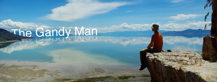
Just wanted to do another quick survey, because I really do value your opinions. Of these which do you prefer: the large, or small font?
Any other observations or critiques are also welcome. And, as always, you can see them in higher resolution on flickr.

4 comments:
I like the one with bigger font.
I like the smaller font better. :)
I like smaller.
I like smaller better. It gives better focus to the temple and I feel like that's the idea, right?
Post a Comment